Interactive animated scatterplot created in Flourish showing predictors of the Yes vote in Australia’s Marriage Equality survey. The lowest Yes vote was in a cluster of suburbs in Western Sydney. Commentators quickly blamed the large immigrant populations in these areas. However, census data shows that the vote within an area was better predicted by median income and the proportion of residents who described themselves as religious versus secular in their beliefs. Explore
Animated proportional bar chart created in Flourish showing changes in seats in the Queensland State Parliament. Explore
GIF created using ggplot2 and Magick packages in R. Data show brain growth charts for infants with and without autism. Overlaying the two groups shows that although on average the autistic babies have slightly larger brains on two out of three measures, there is substantial overlap, making it difficult to predict diagnosis from brain measures. From my Guardian article “Autism diagnosis by brain scan: It’s time for a reality check”.ArticleCodeWaffle plot created using the waffle package in R. Also taken from my Guardian article “Autism diagnosis by brain scan: It’s time for a reality check”. Authors of the study claimed that the brain imaging measure differentiated between babies who did versus did not have autism with 88% sensitivity and a false positive rate of just 5%. However, many of the infants had incomplete data and so had to be excluded from the analysis. And taking into account the low base rate of autism in the general population, we can see that the vast majority of babies who test positive are not autistic. While an interesting finding, it is of limited clinical value, as this plot shows. ArticleCode
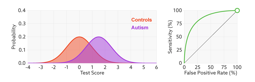
GIF from my Spectrum article “Quest for autism biomarkers faces steep statistical challenges, co-written with my brother Tim Brock. We used animation to introduce the concept of a Receiver Operating Characteristic curve, which plots the sensitivity of a test against its false positive rate for different cut-offs. ArticleThis figure from the same article shows how the performance of a test changes with the base rate. In a typical research study, half of the people will have autism and half won’t. In the general population, the current estimate is that only one in 68 have autism. This means that, even with a highly discriminating test most people who test positive don’t actually have autism. Article
Plot created using ggplot2 in R showing the relationship between performance of autistic children on a reading test and four other measures. I overlaid the observed data (black dots), the model fit (orange lines) and the adjusted values for each observation (orange dots) with confidence intervals. This demonstrates that the fourth measure, Picture naming, is the best predictor with the closest fit between the model and the observed data. PaperCode
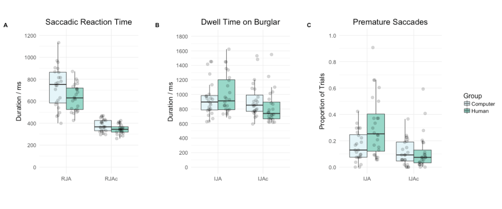
Boxplot and overlaid swarmplot created in R using ggplot2. From our paper “Detecting communicative intent in a computerised test of joint attention” in which participants interacted with an avatar on a computer screen. Eye-movement analysis showed that participants interacted with the avatar differently depending on whether they thought it was controlled by another human or by a computer. PaperCode
Waveform figure created in ggplot2 showing brain responses to six different sound stimuli. Typically, researchers only report the response averaged across all the participants. Here we show the response of each individual (in grey), giving an indication of variability between participants. From our 2017 paper “The magnetic acoustic change complex and mismatch field: A comparison of neurophysiological measures of auditory discrimination.”PaperCode
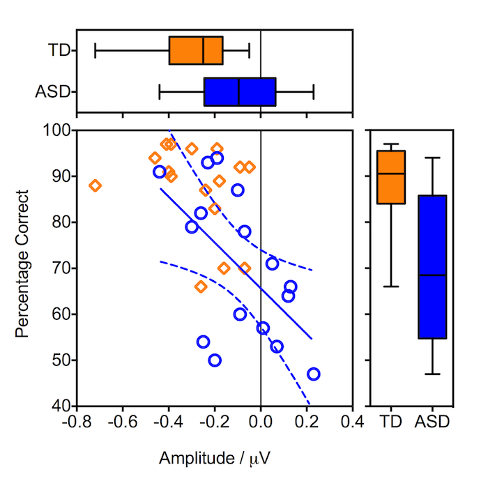
Scatterplot with marginal boxplots created in Prism. The scatterplot shows how the performance of people with autism on an auditory discrimination task is predicted by the amplitude of their brain response to the auditory stimuli. Boxplots show the distributions of the two measures for people with autism and typically developing controls. From our 2013 paper “Reduced object related negativity response indicates impaired auditory scene analysis in adults with autistic spectrum disorder” Paper